Bringing Peace and Tranquility into Your Home with the Perfect Shade of Blue
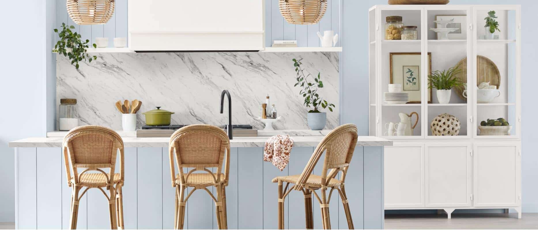
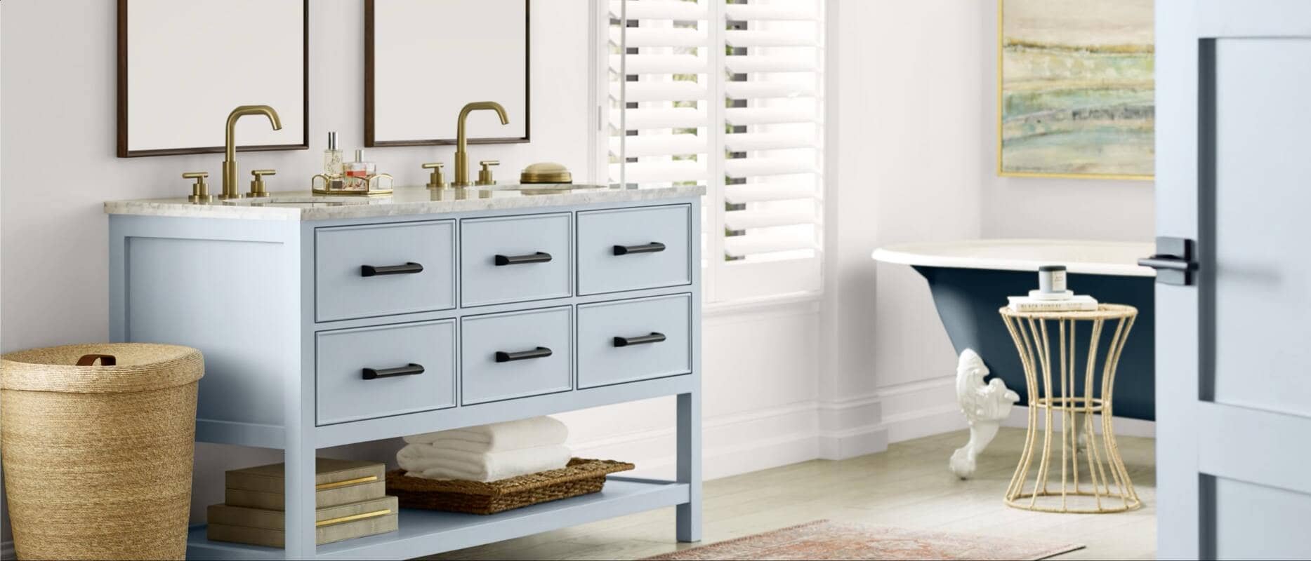
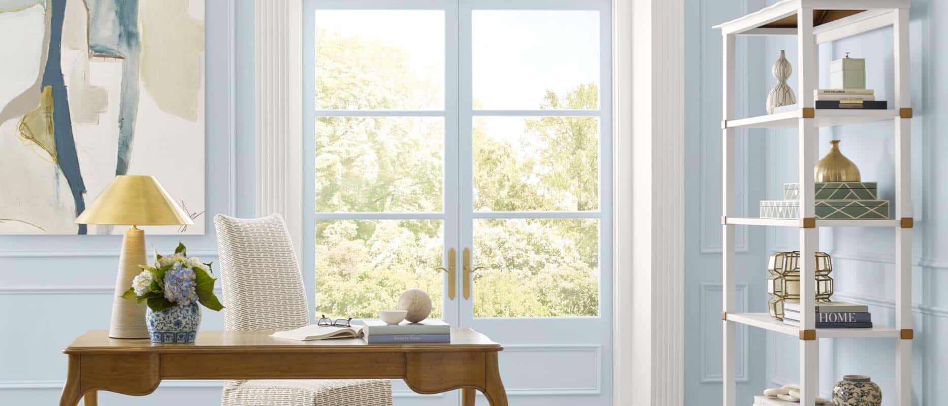
Sherwin-Williams has once again captured the essence of serenity and harmony with its 2024 Color of the Year, Upward SW 6239. This delightful shade of blue invites us to slow down, take a deep breath, and clear our minds, all while infusing our spaces with a sense of ease and possibility.
A Breath of Fresh Air
Upward SW 6239 embodies the gentle forward momentum in our lives, according to Sue Wadden, Director of Color Marketing at Sherwin-Williams. It evokes the carefree energy of a sunny day, promoting contentment and peace. With this colour, Sherwin-Williams encourages us to embrace a new sense of tranquility that doesn’t overwhelm but establishes meditation and tranquility.
As we explore the possibilities of using Upward SW 6239 in our homes, it’s crucial to consider how it interacts with other colours thoughtfully. Warmed-up blues may result in hues that appear muddled and lackluster. Therefore, preserving the crispness and magnetic allure of cool blues like Upward is essential. These subtle nuances create spaces that stand the test of time and inspire enchantment.
Pairing Upward SW 6239 with Other Colours
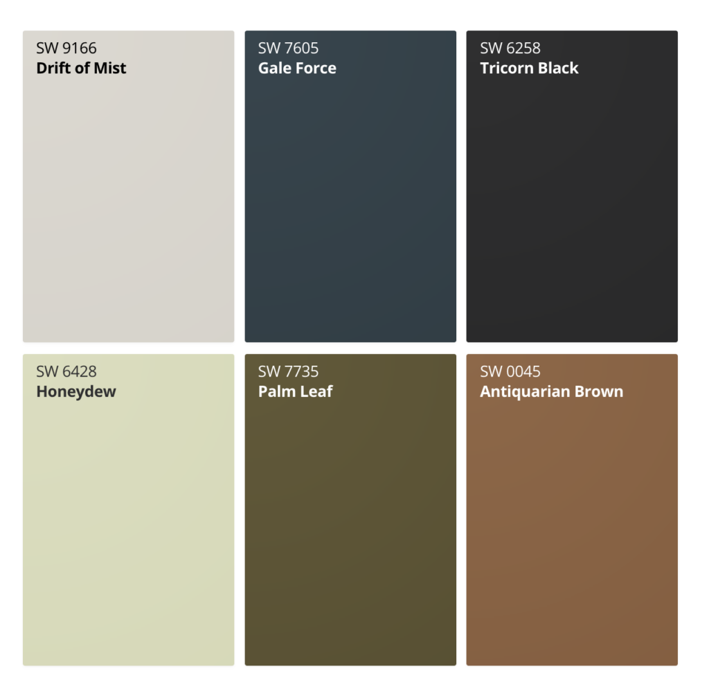
Upward SW 6239 belongs to Palette No. 1 in Sherwin-Williams Colormix® Forecast 2024, Anthology: Volume One. Sue Wadden suggests pairing this serene blue with a variety of colours to create harmonious interiors. Some excellent companions for Upward SW 6239 include:
|
SW 9166 |
Drift of Mist | A soft and airy hue that pairs well with Upward |
| SW 7605 | Gale Force | A deep and dark shade that adds depth to your colour palette. |
| SW 6528 | Tricorn Black | A classic black that provides a striking contrast to Upward. |
| SW 6428 | Honeydew | A light and refreshing green that harmonizes with Upward. |
| SW 7735 | Palm Leaf | A muted green that complements the calming effect of Upward. |
| SW 0045 | Antiquarian Brown |
A rich and earthy brown that adds warmth to the palette. |
Creating Tranquil Spaces
Upward SW 6239 is the perfect choice to inspire meditative spaces and absolute peace, whether in your home or commercial settings. It seamlessly fits into various design styles, from classic coastal to casual Nordic, offering a breezy, airy feel that adds a hint of silver lining to any space.
Whether used as an accent or covering entire interiors and exteriors, Upward SW 6239 encourages open-mindedness in commercial settings. It serves as a gentle reminder to pause and ponder the limitless possibilities that await in our workspaces, dining areas, educational facilities, and beyond.
The Colormix® Forecast 2024
Sherwin-Williams’ global color and design team, led by Sue Wadden, continuously researches and identifies key trends that shape our interactions with color. From these insights, they create the annual Colormix® Forecast, featuring trending palettes for the upcoming year. The Anthology collection delves into the meaning behind chosen colors, their role in modern aesthetics, and their future significance. A new biennial approach is introduced this year with the release of the first half of the collection, Colormix® Forecast 2024, Anthology: Volume One. The trend report presents a collection of 48 hues categorized by color family. Upward SW 6239 is part of the No 1. Blue & Greens category in Volume 1, along with 11 other hues.
Embrace the calming influence of Upward SW 6239 and infuse your spaces with tranquility and ease. Whether you’re redecorating your home or revitalizing your workplace, this serene blue shade is your gateway to a more peaceful environment. Explore the possibilities and paint your world with Upward SW 6239.
Need more help with selecting the right colour for your painting project?
Hemlock Painting offers colour consultation as part of our services. Contact us today and we will be happy to provide you with expert tips and colour advice.
